
15 Bold Modular Kitchen Colour Combinations Shaping 2025 Trends
Look, kitchens back in the days just used to be background noise. The kitchen was a place to dump dirty dishes, heat the leftovers, maybe brew coffee. Not anymore. These days, the kitchen interiors is the main event.
It’s where the gossip happens, where you dance around each other for snacks, and where everyone ends up at every party. And colours? They’ve taken over.
Forget “safe” whites and bland beiges. The modern kitchen color combinations we’re seeing now are all about attitude.
Think bold emerald cabinets, soft pinks with rich wood, warm earthy tones that feel like a hug. These aren’t just pretty—they’ve got personality. They make your kitchen feel alive.
Calm one minute, cozy the next, sometimes dramatic... even a little extra. And you know what? That’s the whole point.
Here’s the funny thing—picking the latest kitchen colour combination isn’t just about making your kitchen look nice. It can actually give your home’s value a bit of a boost. Especially in Bangalore, where buyers walk in and head straight for the kitchen. If it looks dated? Game over. If it feels fresh? You’ve got their attention. If yours feels updated and stylish? Big win.
Don’t buy the hype from those perfect Pinterest kitchens. That dark matte finish? Sure, it looks cool on your screen, but in real life? It’s a smudge magnet. You’ll spend more time cleaning than cooking. It shows every single fingerprint. One sandwich later, and you’re wiping down cabinets like it’s a full time job. Earthy tones? Way easier to live with. Style’s great. Function? Even better.
So, here’s the plan: we’ll walk you through 15 latest modular kitchen colour combinations that are shaking things up this year. Plus, we’ll help you avoid common mistakes and choose something that actually works for you.
Colour defines character in modern kitchens. The right combinations don’t just add beauty, they shape mood, style, and functionality-setting the tone for 2025 design trends.
How to Pick a Kitchen Colour Without Losing Your Mind
Trends are fun, but your kitchen still needs to work. The latest colour combination for the kitchen should match your everyday life and not just what’s popular online. You’re the one using that kitchen every day, so it needs to feel right for you.
So you should ask yourself:
- How much light do I need here?
You got a bright, sun drenched space? Go dark. Charcoal, navy—go for it. If your kitchen’s tucked into a darker corner, stick with lighter, airier shades. - Is it tiny or spacious?
Small kitchens need light colours to breathe. Big ones can carry bolder looks without feeling cramped. - What’s staying?
Be real—are you keeping the countertops? The tiles? The floors? Your new colours should work with the old stuff. Or else, it’s gonna look like a patch job.
Start simple. A timeless base. Then throw in some personality—maybe through your cabinets, maybe just a bold backsplash. The point is: your kitchen should flow, not fight with itself.
Before You Commit, Question Yourself:
- Will this colour make the room feel bigger... or smaller?
- Am I gonna hate this in two years?
- Does this match my counters and floors—or is it about to cause chaos?
5 Bold Combos for Kitchens That Want Attention
- Sage Green + Warm Gold
Fresh but fancy. Soft green keeps things chill, gold finishes turn up the class. Works beautifully in both old-school and modern homes. - Midnight Blue + Champagne
Dramatic navy with a little sparkle? Yes, please. Add under-cabinet lighting and it’s instant mood. - Charcoal Gray + Brass
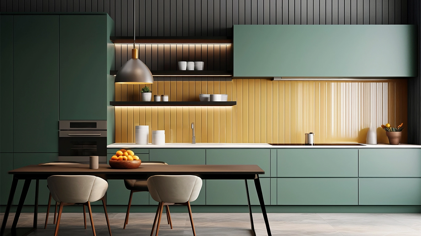
Sleek, sharp, with a bit of edge. Charcoal matte cabinets and warm brass handles? Match made in kitchen heaven. - Emerald Green + Gray + Beige
Emerald is a whole vibe. Gray and beige help ground it so it doesn’t take over. Just enough bold, just enough calm. - Blush Pink + Walnut Wood
A little sweet, a little grown-up. The walnut grain cuts through the pink and keeps it from feeling like a cupcake.
5 Warm & Earthy Combos That Just Feel Good
- Terracotta + Cream + Walnut
Terracotta walls, creamy cabinets, walnut shelves. Feels like it belongs in a sun-soaked Italian home. - Burnt Orange + Beige
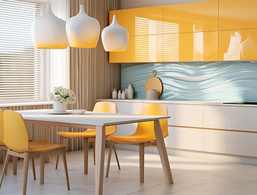
That warm, toasty orange paired with calm beige is rustic but modern. Stainless steel appliances pull it all together. - Brown + Gold
This one’s timeless. Rich brown cabinetry with golden fixtures? Always looks rich. Always feels right. - Olive + White + Muted Navy
Olive’s earthy. White keeps it clean. Navy adds a tiny bit of drama. You won’t get bored of this one. - Peach + Gray + Ebony
Unexpected, but it works. Peach brightens it up, gray keeps things grounded, and ebony brings the cool factor.
5 Fresh Combos That Keep Things Clean & Chill
- Soft Beige + Matte Black
Minimalist and modern. Beige stops the black from feeling cold. Great for sleek, handle-less cabinet styles. - Blue + Teal + Gray
This one’s like a beach day. Cool, breezy, relaxed. Blue walls, teal tiles, gray cabinets—it just works. - Green + Mint + Aqua
It’s fun. It’s light. It’s great in small kitchens with open shelving. Mint cabinets? Yes. - Classic Blue + Gray + White
A safe bet, but not boring. Feels balanced, never dated. - Lavender + White + Walnut
A bit fancy, but calming. Lavender soothes, white brightens, walnut warms it all up.

Final Thoughts: Don’t Just Wing It
Picking the latest modular kitchen colour combination is fun—until it’s not. So don’t rush it.
Here’s how to keep it smart:
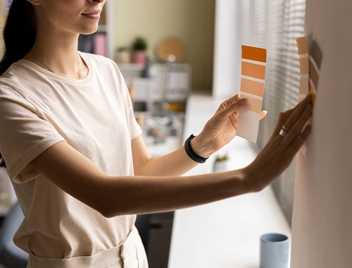
- Test before you commit. Always check paint samples in your actual kitchen. Under your lights. Colours lie under different bulbs.
- Make it match. Don’t pick a wall colour that might clash with your cabinets. Everything should feel like it belongs.
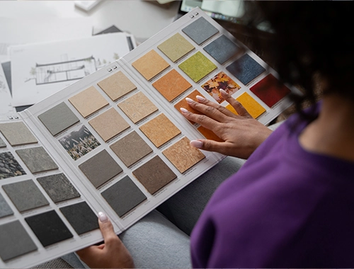
- Check what’s in stock. In Bangalore? Brands like Asian Paints, Berger, and Nippon Paints have solid options. No point falling for a colour you can’t get.
- Make sure it’s something you can actually live with. Matte black? Looks amazing—until the smudges show up five minutes later. Mid-tone earthy shades, though? Total lifesavers. They hide the mess and still look good, especially if your kitchen’s a busy one.
Plan it well, and your kitchen will look awesome and still hold up when life happens.
FAQ: Your Top Questions
Start by assessing your kitchen’s lighting, size, and existing elements like countertops and floors. Bright spaces can handle bold, dark colours while smaller kitchens benefit from lighter shades. Also, ensure your chosen colours harmonize with your fixed features for a cohesive look.
Popular combos include Sage Green with Warm Gold, Midnight Blue paired with Champagne, and Charcoal Gray with Brass. Earthy palettes like Terracotta with Cream and Walnut or Olive with White and Muted Navy are also trending.
Choose colours that are both beautiful and practical. Matte black offers sleek looks but shows fingerprints easily, whereas mid-tone earthy shades hide wear and tear better. Always test paint samples in your kitchen lighting before committing.
Yes, a fresh and stylish kitchen colour palette can significantly boost your home’s appeal, especially in markets like Bangalore where kitchen aesthetics heavily influence buyer interest. Selecting tasteful, well-balanced colours is key.
Brands such as Asian Paints, Berger, and Nippon Paints in Bangalore have a wide array of modern kitchen-appropriate colours. Checking availability beforehand ensures you get the exact shades needed for your project.