
Study Room Color Combinations That Enhance Focus and Comfort
Choosing the best color combination for study room walls?It’s not just what the walls look like. It’s what they do to you when you sit down. You open your book, your screen lights up—and suddenly the room either helps or hurts. Some colors calm the noise. Others? Just make your brain wander. Some colors calm the mind. Others keep you alert. And the wrong mix? Total distraction.
Think about it. You wouldn’t spend hours in a bright neon pink room without feeling restless. At the same time, too much grey might make you want to nap instead of study.
The right color combo? It messes with your head—in a good way. Suddenly you’re not just sitting there dreading the work. You’re locked in. Mood’s right. Focus clicks. Studying doesn’t suck as much. Maybe you even enjoy it. Weird, huh?
This isn’t just about paint looking nice. It’s about function. Comfort. Focus. A study space is personal, and the colors you pick shape how you work in it. That’s why finding a study room color combination that actually supports concentration is a big deal.
So let’s dive into real, practical study room paint ideas backed by psychology and design.
The right color palette can boost concentration while keeping the space calm and inviting—perfect for study rooms that inspire productivity and comfort.
Why Color Matters in a Study Environment
Psychological Impact of Colors
Colors talk to the brain without words. Blue slows your pulse and makes the room feel steady, perfect for reading or writing. Green reminds you of nature—calm, steady, restful. Yellow? That one wakes up your creative side, like a little spark.
Too much of any one color throws things off. Too much red feels aggressive. Too much grey feels dead. Balance matters.
Influence on Mood and Productivity
Ever tried working in a messy, mismatched space? Doesn’t it drain your energy fast. The same happens with colors. If the color combination for study room walls is off, your brain tires quickly. But when the colors feel right? You don’t even notice time moving. You sit, you focus, you flow. Hours go by, and you’re still in the zone.
Things to Keep in Mind Before Picking Colors
Who’s Using the Room?
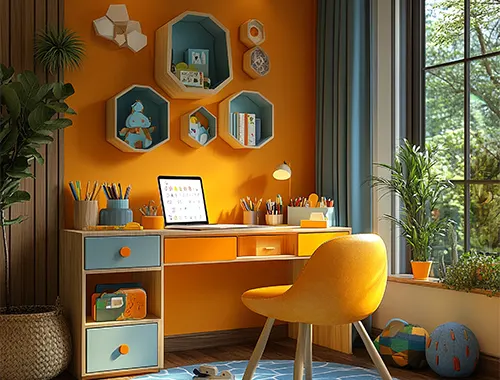
- Kids: They need energy, but not chaos. Think sky blue, lemon yellow, mint green. Colors that feel like play but still help them stay put.
- Teens: They're in between. Not little kids, not quite adults. Navy, olive, or a nice dark grey hits that balance — mature but not stiff.
- Adults: Go for soft neutrals. Keep it chill. Then drop in a splash of blue or teal to help your brain stay steady.
What’s the Room For?
- Reading, writing, studying hard stuff: Cool tones help. Soft blues. Gentle greys. They don’t shout. They let your brain breathe.
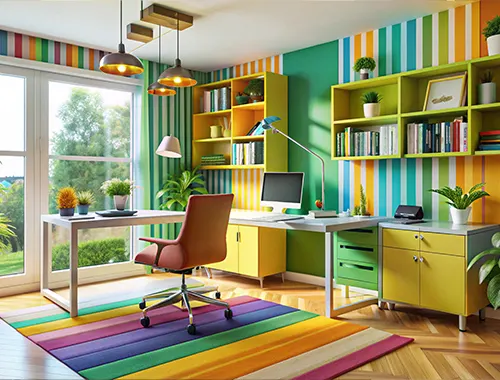
- Creative work: You want a little spark. A pop of orange or yellow — not everywhere, just enough to kickstart ideas.
- Screen-heavy jobs: Neutrals are your friend. Less glare, less eye strain, more comfort.
Light and Space
- Natural light changes everything. A pale green looks fresh in a sunny room. Same color in a dark corner? Not so great.
- Got a tiny room? Go light — cream, pale grey, soft blue.
- If your space is big and bright, that’s your green light to try bold tones without making it feel cramped.
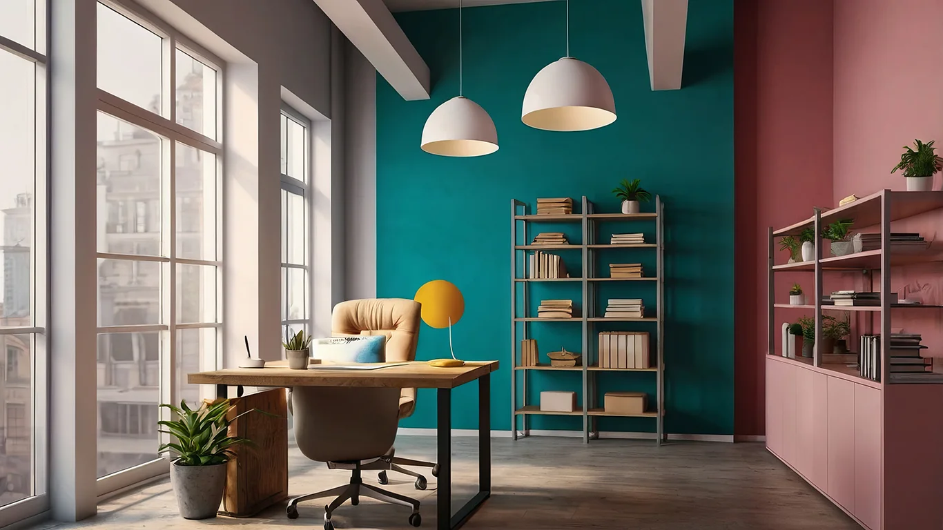
Top Study Room Color Combos and What They Do
| Blue + White – Calm and Focused | Blue walls with crisp white trim. It’s clean. It’s clear. It’s one of the best wall colors for concentration, hands down. |
| Green + Beige – Relaxed and Grounded | This combo feels like a walk in the park. Green keeps you chill, beige keeps things warm and steady. |
| Light Grey + Yellow – Serious with a Little Spark | Grey sets the tone for focus. Add yellow here and there for energy — like in a chair, a lamp, or a shelf. |
| Cream + Pastel Pink – Cozy and Light | This one’s soft. It’s kind. Great for small spaces that need a bit of warmth without being loud. |
Quick Picks Based on Who You Are
- Kids: Sky blue, lemon yellow, mint green. Playful but not wild.
- Teens: Navy, grey, olive green. Cool, a little moody, but not boring.
- Adults: Neutrals with teal or blue accents. Grown-up and grounded.
Accent Walls and Two-Tone Tricks
Go bold on one wall. Navy, forest green, mustard yellow — just one. Makes the room pop without taking over.
Mix it up: Paint most of the space in a calm neutral. Then toss in a stripe or corner in something brighter — orange, yellow, or teal works great.
Study Room Paint Ideas: Finishes and Textures
- Matte: No glare. Great if you stare at screens all day.
- Satin: Easy to clean. Especially if the kids like to “decorate.”
- Semi-gloss: Shiny. Brightens up a space, but don’t overdo it.
- Chalkboard paint: Honestly? Super handy. Write notes. Sketch ideas. Then erase and do it again.
If you want the walls to look decent a year from now, go washable. Trust me.
Light and Decor – Don’t Forget the Extras
Lighting first.
Warm bulbs = cozy vibes. Work well with beige, cream, or warm tones.
Cool bulbs = cleaner feel. Better for blues and greys.
Decor? Keep it chill.
Don’t clutter the walls. A shelf here, a frame there. That’s enough.
Wooden desks? Always a win. They go with almost anything and make the space feel more grounded.
What Not to Do
- Too many loud colors: Red, orange, neon green all fighting? Nope. Your brain can’t handle that.
- Dark tones in tiny rooms: Makes everything feel like a cave.
- Too many bold pieces at once: It’s a study room, not a carnival.
Pick one or two standout colors. Then surround them with neutrals to keep the balance.
Livin Interiors Knows the Game
At Livin Interiors, we don’t just pick colors because they look cool. We think about your brain, your vibe, your space.
Every study room color combination we suggest is built around how you live. Your age, your lighting, your focus level.
Want a room that works with you, not against you? Talk to our team. We’ll help you pick colors that make sense — not just look pretty.
Final Thoughts
Choosing the best color combination for study room walls isn’t about following what’s trendy on Pinterest.
It’s about building a space that makes you want to sit down and do the thing. Work. Read. Create. Focus.
Before you paint:
- Test a few colors
- Check them in daylight and at night.
- Think about who’s using the space.
When the palette’s right, the room just clicks.